I am a versatile graphic and multimedia designer with extensive expertise in print and web design, HTML email production, video editing, motion graphics, multimedia creation, audio editing, and voiceover.
Additional experience: Power BI, Power Apps (Canvas), WordPress, and LMS training program development.
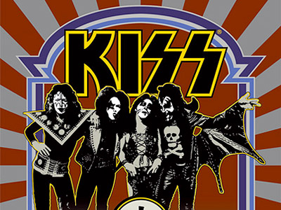
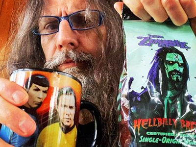
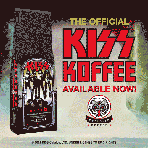
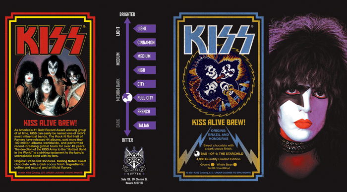
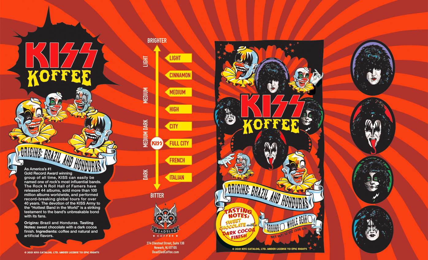
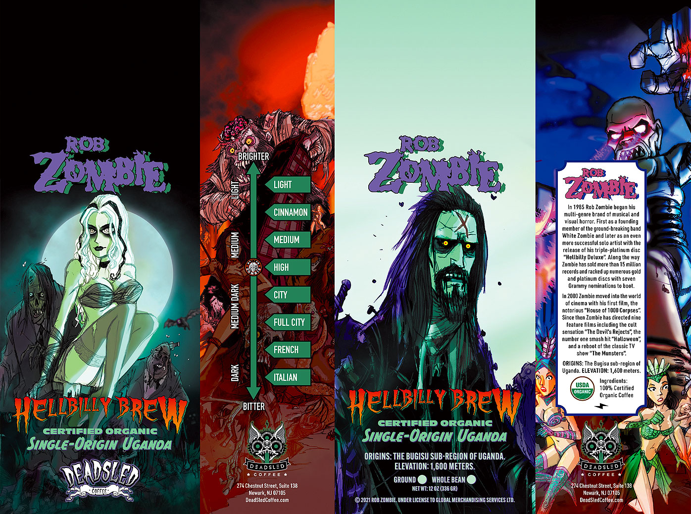
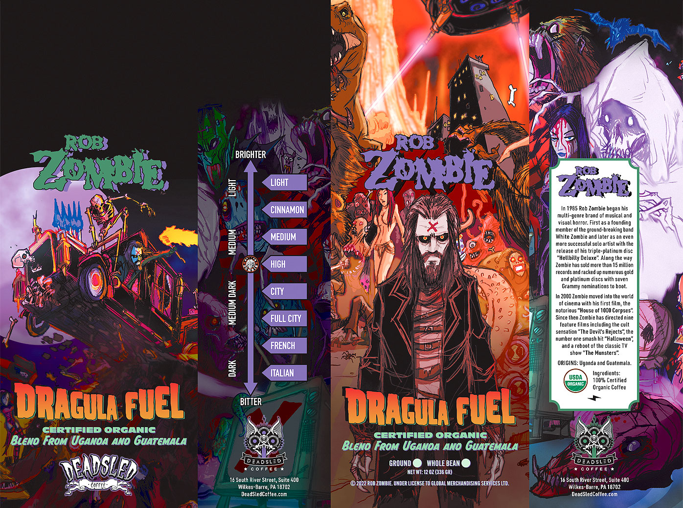
When Dead Sled Coffee approached me to design not one, not two, but three coffee bags for the hottest band in the world (with the hottest drink in the world ) they picked the right guy for the job. Drawing KISS’ iconic logo, makeup, and costumes on my notebooks since I was in the 5th grade made them the one client whose brand guidelines I didn’t have to check before starting the work!
Animated GIF Promo:
Limited Edition Coffee Bag (four versions: Starchild, Demon, Catman, Spaceman):
Permanent Coffee Bag Design:
Exclusive KISS Kruise X Limited Edition Coffee Bag:
Rob was not only very hands-on with the development of what went inside of his Dead Sled coffee bag but also with what went on the outside. He provided amazing illustrations from artist David Hartman for me to incorporate into the packaging design, and also recorded original music for the video promo that I created.
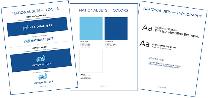
Established in 1947, National Jets were looking for a branding update. I cleaned up the illustration and typography on their existing logo, established the color palette, and then tied the updated design into their business cards, trade show booth, and lanyards, and continue to manage their brand throughout all of their promotional materials.
A lot goes into making the emails that you receive look their best on whatever device and application you are viewing them on. Watch the demo below to see four client-provided designs that I coded and tested. Code tested with Litmus.
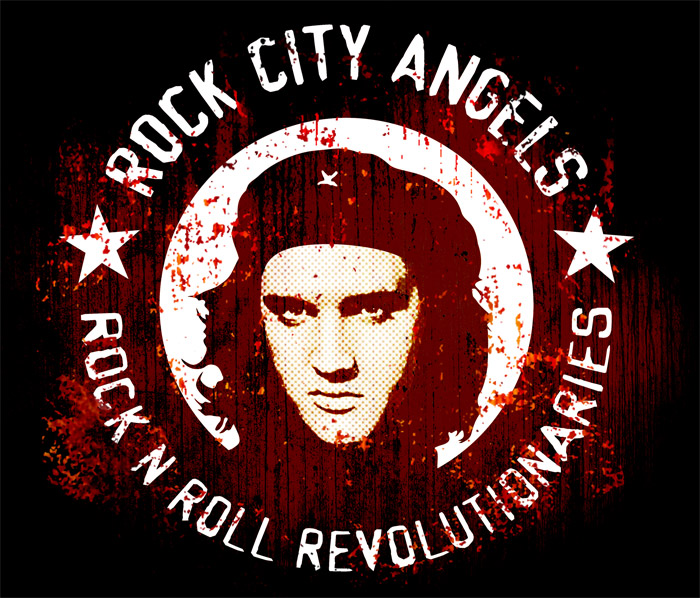
When Rock City Angels’ lead vocalist Bobby Durango asked me to design a logo for him the only direction he gave me was “I want it to convey that we are rock n' roll revolutionaries!”. After kicking the idea around for a bit it dawned on me — who is the most iconic rock n' roll star and the most iconic revolutionary? Elvis Presley and Che Guevara. Thus, Chelvis was born.
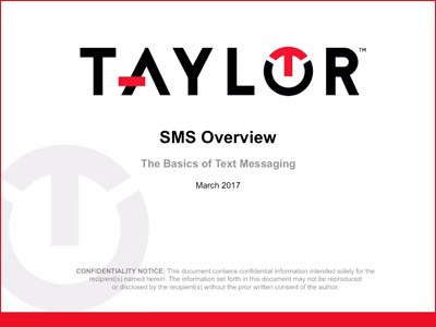
One of a series of instructional webinars that I voiced for Taylor.
Taylor Webinar — SMS Overview:
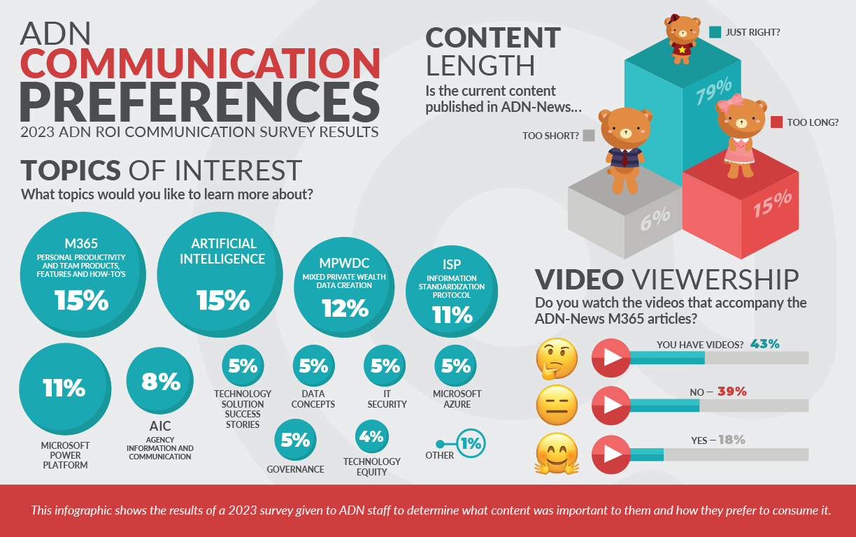
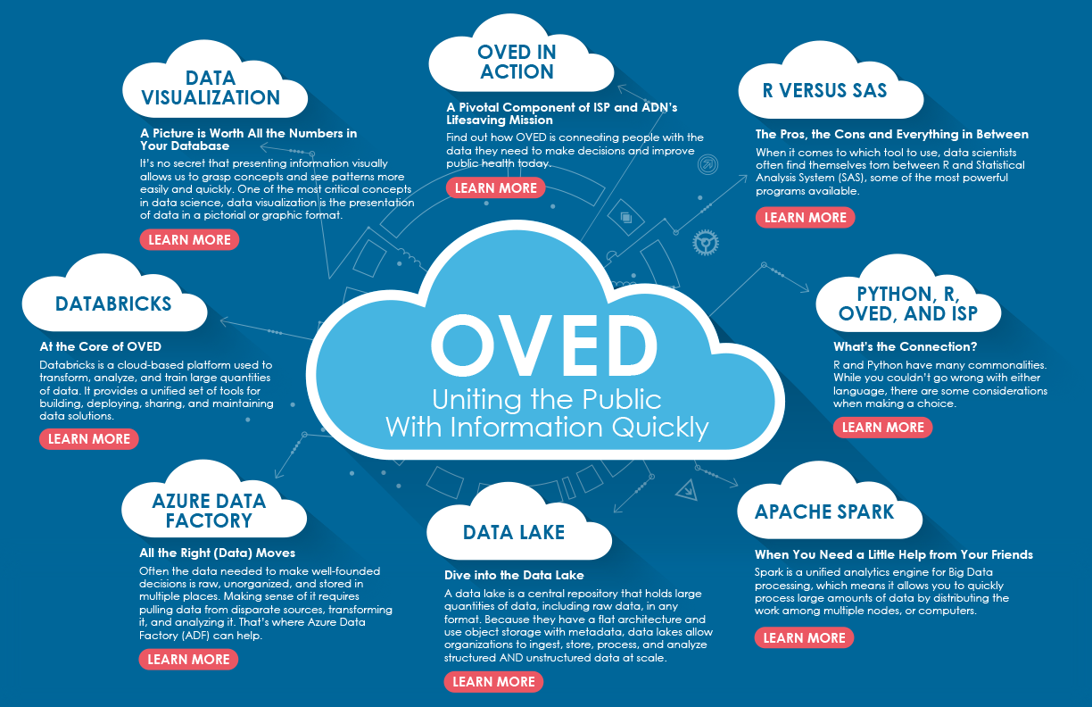
eNews Campaign Infographics
Category: Infographic Design
Client: ADN eNews
In addition to designing emails and SharePoint landing pages for the weekly ADN eNews campaign, I also developed multiple infographics to visually present audience survey results and summarize key topics from multi-part series.
I created this video for the IDASH program, incorporating dynamic visuals to highlight an innovative training initiative aimed at enhancing the use of public health data. The video underscores the growing need for skilled professionals who can leverage cutting-edge digital health tools and strengthen public health information systems.
IDASH Public Health Informatics Training Program Video:
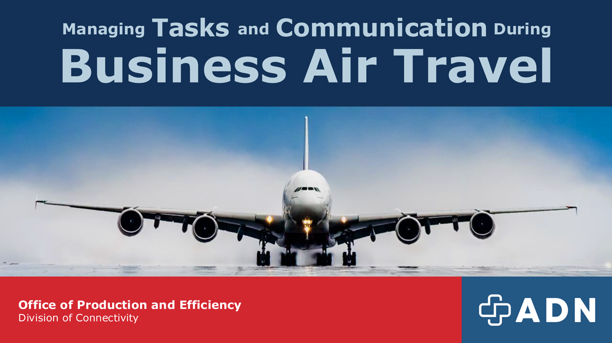
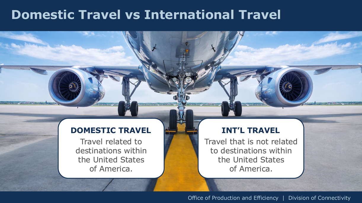
Business Travel PowerPoint Presentation
Category: PowerPoint Design
Client: ADN
Microsoft PowerPoint is one of the most widely used office tools in today's workplace. While many use it, few truly master it. I have applied my design expertise to transform PowerPoint into a powerful medium for creating visually compelling and effective presentations.
Sample Slide 01
Sample Slide 02
Sample Slide 03
Teams Hybrid Meetings Tutorial
Category: Video Editing
Client: ADN eNews — M365 Cloud Solutions
In addition to designing emails and SharePoint landing pages for the weekly ADN eNews campaign, I also edited video content to enhance and support the messaging. Upon receiving the raw tutorial footage of the presenter speaking, I handled the final edits and enriched the videos with motion graphics and other visual elements to ensure a polished, engaging presentation.
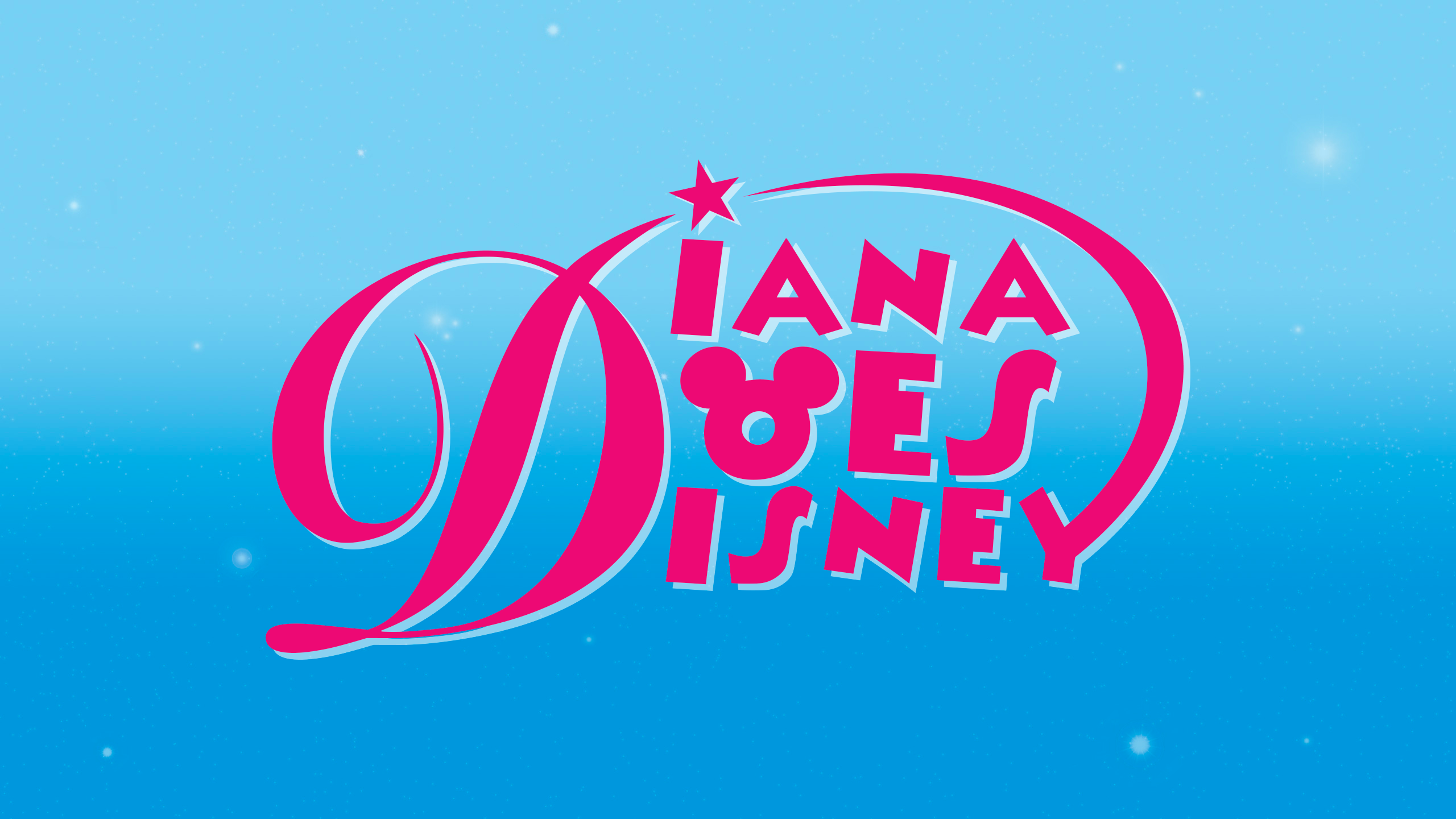
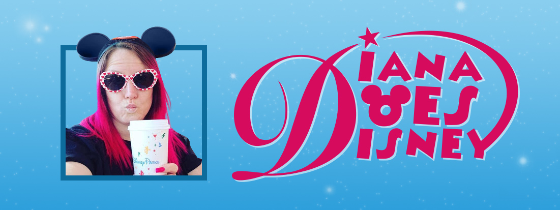
The challenge in creating the identity for the Disney Park YouTube vlogger channel “Diana Does Disney” was to capture the spirit and magic of Disney without drawing the attention of its famously vigilant legal team. The solution was to use typography that evoked the charm of Walt Disney’s iconic signature, featuring a stylized (but legally distinct) mouse-ear “o” and a star swooping in to dot the “i”, nodding to Tinker Bell’s signature stardust wand tap.
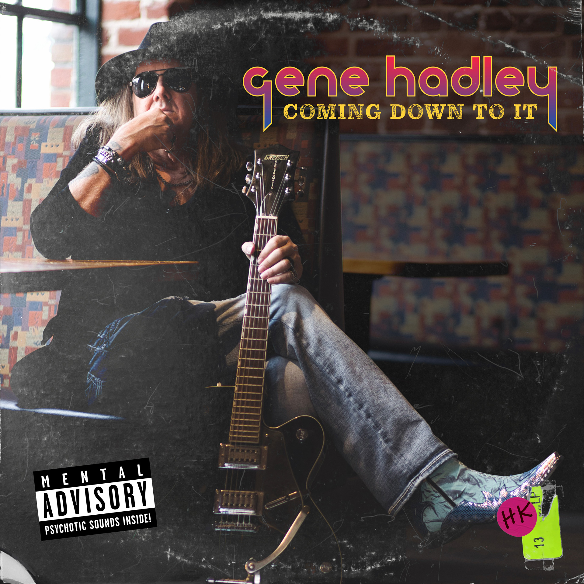
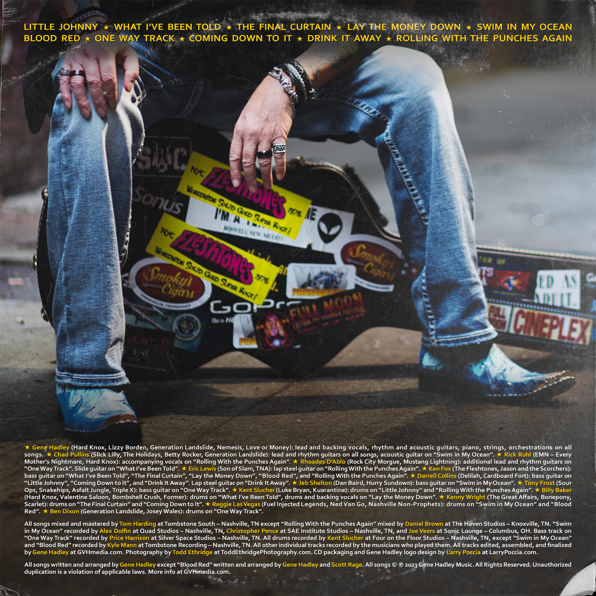
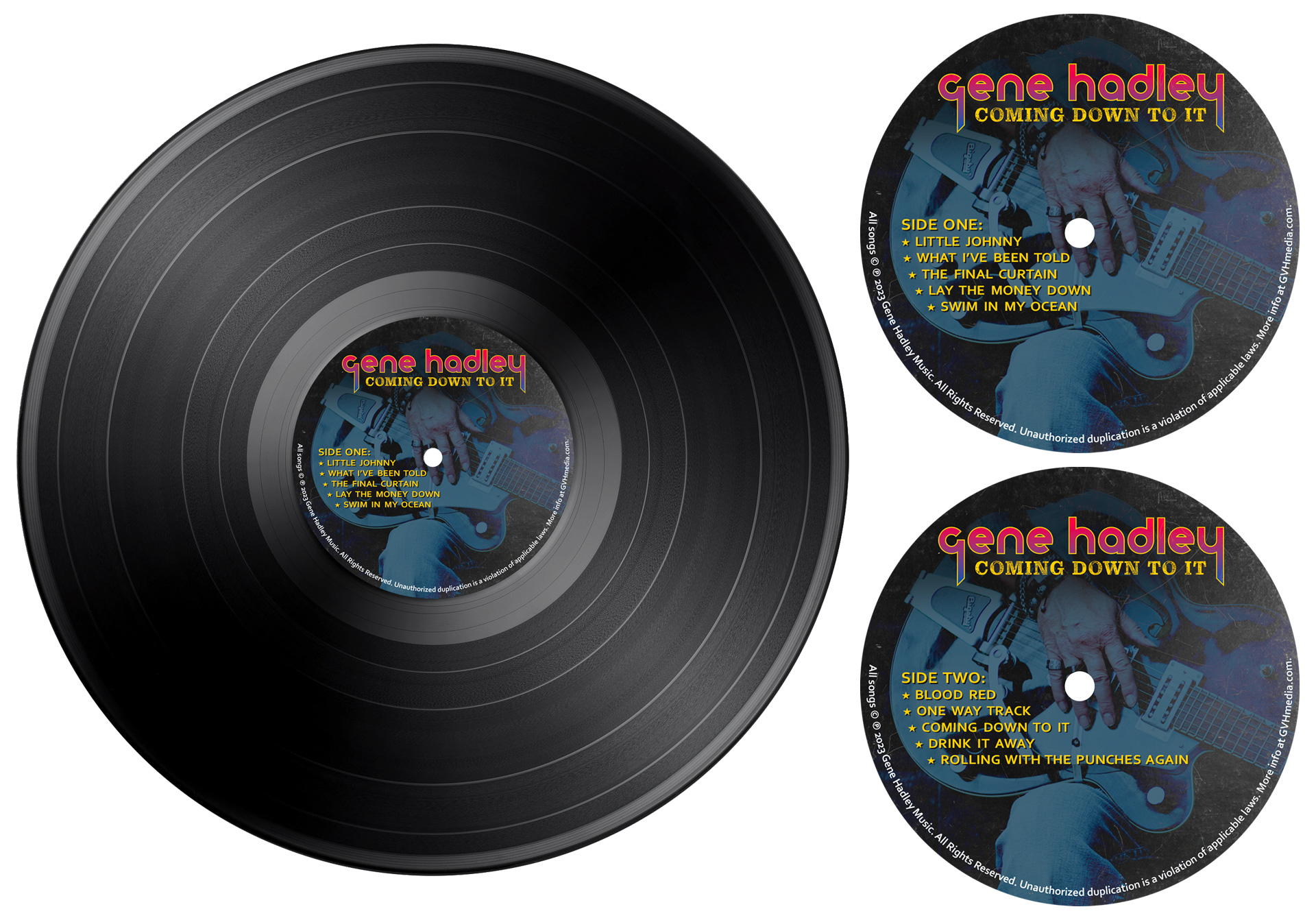
Singer, songwriter, and guitarist Gene Hadley’s music channels the raw energy and swagger of classic ‘70s rock icons like T. Rex, Alice Cooper, and Iggy Pop. When designing the vinyl record packaging for Gene’s “Coming Down to It” album, I aimed to visually echo that era’s gritty, rebellious spirit. The concept was “lost gem from the cutout bin,” brought to life with deliberate touches like faux scratches, worn edges, a clipped corner, half-torn price stickers, and a tongue-in-cheek “Parental Advisory” parody label.
To complement the packaging, the logo needed to reflect the era while carving out a distinct identity for Gene. I drew inspiration from the bold typography, color gradients, and proto-punk/glam-rock flair of bands like The Stooges, Suzi Quatro, and ‘70s-era KISS — balancing nostalgia with a modern twist that speaks to today’s audience.